


LMAX Exchange
Every web based product is adding “responsive design” to their feature lists. Unfortunately in many cases that responsive design is actually making their product much harder to use on a variety of screen sizes instead of easier.
The problem is that common CSS libraries and grid systems, including the extremely popular bootstrap, imply that a design can be made responsive using fixed cut-off points and the design just automatically adjusts. In reality making a design responsive requires tailoring the cut off points so that the design adjusts at the points where it stops working well.
For example, let’s look at the bootstrap documentation and in particular the top menu it uses. The bootstrap documentation gets it right, we can shrink the window down right to the point where the menus only just fit and they stick to the full size design:
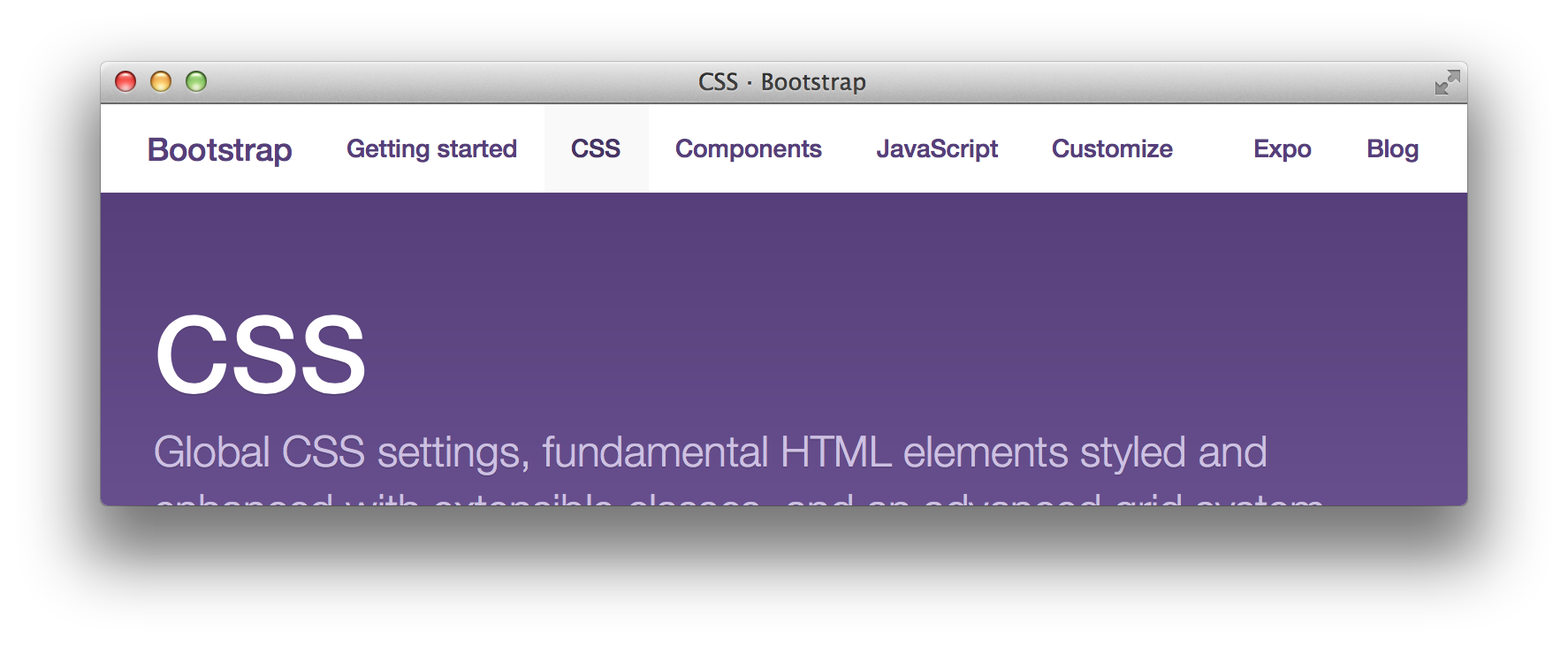
Menu remains full-size for as long as it can fit.
If we shrink the window further the menus wouldn’t fit anymore so they correctly switch to the hamburger style:
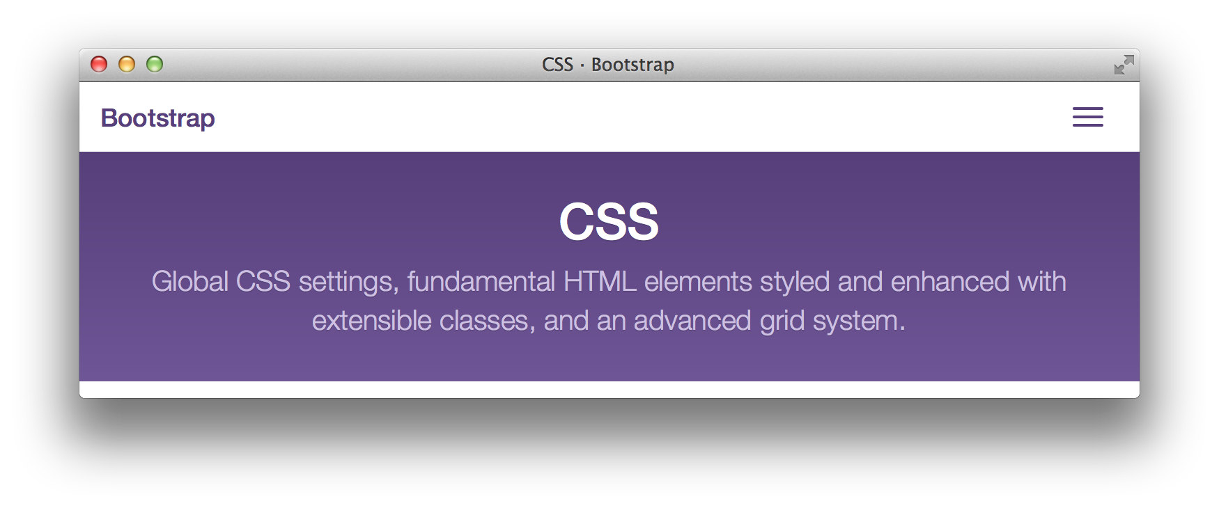
Menu collapses once it would no longer fit.
That’s the right way to do it. The cutoff points have been specifically tailored for the content. There are other stylistic changes as well as these structural ones the designer believes that centred text works better for headings on smaller screens for example. That’s fine, they’re fairly arbitrary design decisions based on what the designer believes looks best. I’m focussed on structural issues.
To see what happens if we ignore let’s pretend that we add a new menu item:
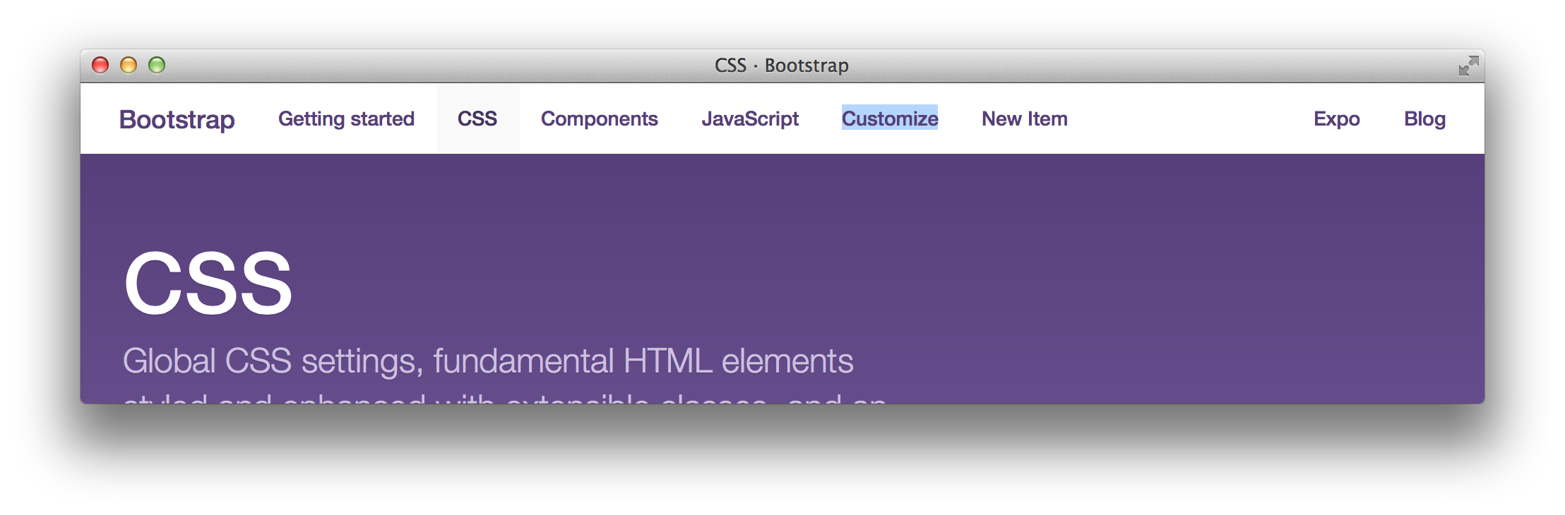
Our “New Item” shown correctly when the window is wide enough.
But now when we shrink the window down, the breakpoint is in the wrong place:
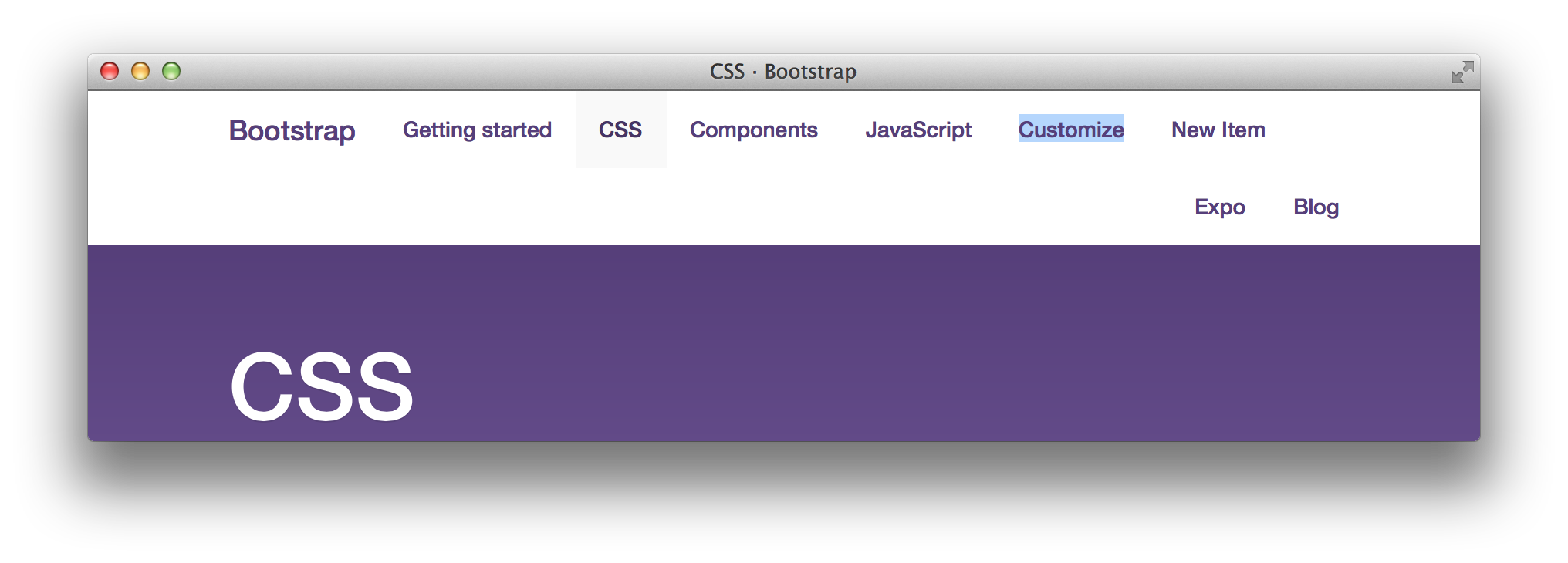
The “New Item” menu no longer fits but causes incorrect wrapping because the break point is wrong.
Now the design breaks as we shrink the window because the break point hasn’t been specifically tailored to the content. This is the type of error that regularly happens when people think that a responsive grid system can automatically make their site responsive. The repercussions in this case aren’t particularly bad, but it can be significantly worse.
Recently Jenkins released a rewrite of their UI moving it to using bootstrap which has unfortunately gotten responsive design completely wrong (and sadly I’m yet to see anything it’s actually improved). Browser widths that used to work perfectly well with the desktop only site are now treated as mobile browsers and content wraps into a long column. What’s worse, the most useless content, the sidebar, is what’s shown at the top with the main content pushed way down the page. At other widths the design doesn’t fit but doesn’t wrap leaving some links completely inaccessible.
It would be much better if people stopped jumping on the responsive design bandwagon and just designed their site to work for desktop browsers unless they are prepared to fully invest and do responsive design right. Mobile browsers are designed to work well with sites designed for desktop and have lots of tools and techniques for coping with them. As you add responsive design and other adjustments designed for mobile you take responsibility for making the design work well everywhere from the browser onto yourself.  Using predefined breakpoints from a CSS library is unlikely to give the result you intend. It would be nice if CSS libraries stopped claiming that it will.